
.This map is similar to the previous, however the lines connect areas of equal wind speed. These types of maps are very specific to weather patterns. This isotach map illustrates the wind velocity and the key states the miles per hour of the wind speed. There are arrows throughout the map indicating which direction the wind is coming from. Unlike the precipitation weekly map, this show the specific daily winds. There is a choice to see regional areas, which zoom in to where you are and are more useful for determining local wind speeds.
Friday, October 21, 2011
Isohyet maps

Also called an Isohyetal line map, these maps show the amount of precipitation. As the scale shows, the colors vary with the amount of rain likely to be produced. The lines are connected and demonstrate inches of rain, in this map, the brown areas demonstrate areas that are unlikely to rain. The map was representative of the probability of the average amount of rain for the whole week so if the viewer of this map wanted information on the likelihood of rain on a certain day before leaving the house, this would not be the best map to view.
LIDAR

LIDAR stands for Light Detection and Ranging. This is a narrow laser beam that can be used to map physical features with high resolutions as can be seen by this map of the coast of San Francisco, California. This type of map is perfect for atmospheric research and meteorology because of its accuracy. NOAA has used this image for shoreline mapping as well as the mean high water tide. Experiments are performed with this type of mapping to quantitatively compare it using VDatum to shoreline compiled with traditional photogrammetric techniques. This will provide NOAA with more accurate data.
Friday, October 14, 2011
Satellite Map
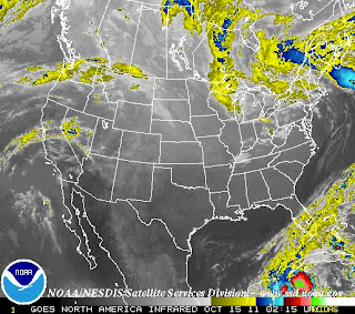
This map was taken from a NOAA satellite and it shows a recent image of the United States. The image is taken in the infrared band light span to show heat within objects. Color demonstrate the variety between the cooler and warmer objects, colder are brighter while warmer are darker. Altitude also has an affect in this image because clouds closer to the continental surface tend to have warmer temperatures, these are depicted by the color gray. Colder clouds, which are generally formed at higher altitudes are highlighted in color because the purpose and focus behind this federal institution is to alert people of possible weather hazards. These clouds are more likely to become a supercell, which provides stronger storms with higher intensity winds, rain, thunder, and possibly produce tornadoes. The infrared system is useful for both day and night since it detects the image based on temperature differences.

The above image shows water vapor in the atmosphere. I have decided to include both these pictures to contrast the difference in the changes of temperatures as compared to atmospheric moisture, during the same period of time. Instead of an infrared satellite picture, this image was taken using a wavelength sensitive to the density of water vapor in the atmosphere. Once again, color and brightness is used to indicate high water vapor, while colored and white areas include high moisture and, or ice crystals-which once again, are more intense, and hazardous weather conditions. Black and brown areas have little to no moisture. This can be areas where there is a drought. It is importance to notice that conditions for La Niña have been detected, which might be affecting the weather system, and this map. These conditions may intensify with time. Wavelength imagery is useful for moisture and atmospheric circulation indicators, as opposed to infrared which is better for determining temperature.
Topography Map

This is a topographic map because it shows elevation on the land. This qualifies this map as being 3-D. Surface elevation is depicted through varying color range and by shadows. Since this is a satellite image, the topography is very accurately mapped, as accurate as a picture. Rivers in the surrounding states are identified by a blue labeled line, so are the surrounding states. The surrounding states are a yellow color, without the 3-D elevation feature. This omission of elevation in these states enhances the contrast between Oregon, which is the country and land area the map was trying to depict, hence the emphasis.
Friday, October 7, 2011
T-in-O map

This shows a T-in-O map. T-in-O or Beatline maps are medieval mapmaking. This shows a very simple map, with North-East-South-West bearings, and the continents of Africa, Asia, and Europe.

Topographic Map

This map from 1677 shows great detail of New England. Trees and rivers portrayed as well as ships, ocean, animals, settlers, hills. This map does not include accurate numbers, however objects are included to symbolize what is included in the land, as well as the ocean. It would be very useful for settlers and people deciding to come to America or not. It would also be useful for Native Americans to see what areas have been settled and which area would most likely be expanded into next.
Mental Map

This ancient map portrays information of the Aztec civilization. It shows a migratory root from their homeland of Aztlán to Tenochtitlán. This map's location is present day Mexico City. This map contains a lot of symbolism which does not make up a majority of currently modern maps because it does not illustrate a physical aspect of the real world, but rather an imaginary route created by people as they walked along this path. Interestingly the orientation of the map changes because the Aztecs divided into tribes along the way. With the passing of time this map has became more of a mental map because of changes in the landscape, no way to trace it, and difficult conception of where someone walked many previous years.
Cadastral Map

This map shows a Polar map. The perspective of it is what makes it unique. Usually shown with Americas to the left or center and Europe Asia to the right, this map show Alaska in its center point, changing society's constructed acceptance of power dynamics within countries. This map is black and white, which eliminates information. It is a pretty basic locational map, with country's names listed. There are some lines running through it which I interpret to be major rivers, however it should be labeled or listed in the key which makes it for easier interpretation and better understanding of the map.
Subscribe to:
Comments (Atom)