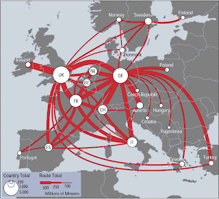
This map shows the flux of telecommunication through a flow map. The line size indicates minute intensity and the country total is portrayed by white circles. The map shows the intensity of telecommunications. It would be interesting to do create a map of this during different times. However, this proposes difficult data to gather especially when there is an increase in details. Interesting to find out how the data was gathered, what time and by whom so that the purpose can be clearer and biases may be lessened. Furthermore, the type of audience that was meant to see this map also affected the map makers decision, especially if he was trying to persuade the audience. Where the map maker is from, working for utility bills, energy sector, or another method of communications could impact the map making process of this type of map. The flow of where the telecommunication is performed can be clearly seen, however if the calls where made or received to that location is not shown.
No comments:
Post a Comment