http://www.crh.noaa.gov/images/grr/aviation/airports/btl/BTLCeiling.png
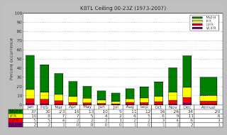
Histograms are a great way to depict data, there are horizontal or vertical histograms. Histograms are similar to bar graphs but usually have connected bars, though this one from NOAA does not.
Map Catalog
Wednesday, November 23, 2011
Correlation Matrix
The correlation matrix is used to see population correlations and sample correlations through standard deviations.
It is also known as a covariance matrix.
Similarity matrix
Similarity matrix are used in sequence alignment, a way of arranging a sequence such as DNA or RNA paring.
Parallel Coordinate Graph
http://andrewgelman.com/2007/10/parallel_coordi/
Parallel coordinate graphs are useful for comparing two variables within a graph.
Parallel coordinate graphs are useful for comparing two variables within a graph.
Windrose
http://www.wcc.nrcs.usda.gov/climate/windrose.html
Windroses are maps in a circular format, this windrose shows the frequency of winds blowing from certain directions and the the frequency of time the wind blows from a particular direction. Each circle represents a different frequency, other information such as directions (North, South, East, West) can also be shown since the windrose map originated from the compass.
http://inquiry.net/outdoor/skills/b-p/compass.htm
http://www.crh.noaa.gov/images/grr/aviation/airports/btl/BTLSpringRose.png
This shows a wind rose of data from Spring time, March-April. A wind rose is a diagram that depicts wind direction and speed distribution at a location over a period of time. The length of the spoke indicates how often the wind comes from that direction, longer spokes mean the wind comes from the direction more often while shorter indicates less frequency. The dotted ring labels indicate the percentage while the colors display how often the wind speed falls within a given range of speed.
Star Plot
http://office.microsoft.com/en-us/excel-help/present-your-data-in-a-radar-chart-HA010218672.aspx
Star plots can display various observations with an arbitrary number of variables. The observations are displayed in a star-shaped manner with a ray for each variable, the length of the ray is proportional to the variable.
Star plots can display various observations with an arbitrary number of variables. The observations are displayed in a star-shaped manner with a ray for each variable, the length of the ray is proportional to the variable.
Index Value Plot
http://waterwatch.usgs.gov/new/?m=pa07d_dry&w=plot
This map type indicates absolute numbers and values. This map indicates the expected percentage of stations bellow water level between the years of 2002-2010.
This map type indicates absolute numbers and values. This map indicates the expected percentage of stations bellow water level between the years of 2002-2010.
Subscribe to:
Comments (Atom)


