Wednesday, November 23, 2011

Histogram

http://www.crh.noaa.gov/images/grr/aviation/airports/btl/BTLCeiling.png

Histograms are a great way to depict data, there are horizontal or vertical histograms. Histograms are similar to bar graphs but usually have connected bars, though this one from NOAA does not.

Correlation Matrix


The correlation matrix is used to see population correlations and sample correlations through standard deviations. 
It is also known as a covariance matrix. 

Similarity matrix


Similarity matrix are used in sequence alignment, a way of arranging a sequence such as DNA or RNA paring. 

Parallel Coordinate Graph

http://andrewgelman.com/2007/10/parallel_coordi/

Parallel coordinate graphs are useful for comparing two variables within a graph.

Windrose

http://www.wcc.nrcs.usda.gov/climate/windrose.html
Windroses are maps in a circular format, this windrose shows the frequency of winds blowing from certain directions and the the frequency of time the wind blows from a particular direction. Each circle represents a different frequency, other information such as directions (North, South, East, West) can also be shown since the windrose map originated from the compass.
http://inquiry.net/outdoor/skills/b-p/compass.htm

http://www.crh.noaa.gov/images/grr/aviation/airports/btl/BTLSpringRose.png
This shows a wind rose of data from Spring time, March-April. A wind rose is a diagram that depicts wind direction and speed distribution at a location over  a period of time. The length of the spoke indicates how often the wind comes from that direction, longer spokes mean the wind comes from the direction more often while shorter indicates less frequency. The dotted ring labels indicate the percentage while the colors display how often the wind speed falls within a given range of speed.

Star Plot

http://office.microsoft.com/en-us/excel-help/present-your-data-in-a-radar-chart-HA010218672.aspx
Star plots can display various observations with an arbitrary number of variables. The observations are displayed in a star-shaped manner with a ray for each variable, the length of the ray is proportional to the variable.

Index Value Plot

http://waterwatch.usgs.gov/new/?m=pa07d_dry&w=plot
This map type indicates absolute numbers and values. This map indicates the expected percentage of stations bellow water level between the years of 2002-2010.

Bilateral Graph

http://seekingalpha.com/article/241440-will-october-s-improved-trade-deficit-continue

The Bilateral graph compares two different items at the same time. Relationships of rises and lows can easily be seen as well as other comparisons useful for practical applications and the gathering of information.

Accumulative line graph or Lorenz curve

http://people.hofstra.edu/geotrans/eng/ch4en/meth4en/gini.html

Accumulative line graph shows the proportionality of a distribution. They elements are ordered from most important to least important, and plotted based on their percentage, then compared to the perfect equality line.
http://pubs.usgs.gov/circ/2007/1294/paper1.html

Tuesday, November 22, 2011

Scatter Plot

http://itl.nist.gov/div898/handbook/eda/section3/eda33q.htm

A scatter plot distributes data across an equal breaks scale, this can either depict a trend or not. This data can be seen that as the in-lab crack size reading increases, so did the in-field readings.

Triangular Plot

http://www.dplot.com/triangle-plot.htm

This triangular plot overlaps clay with silt and sand percentages in a soil texture analysis. This information is useful for USDA especially within different regions and soil compositions. The Triangular plot makes the comparison more evident.

Climograph

http://www.srh.noaa.gov/bmx/?n=bhmclimograph

Climographs are extremely pertinent to weather prediction centers, local weather stations and research. Climographs show monthly precipitation, maximum and minimum temperature, the average temperature in Birmingham, Alabama. The most important correlation is that temperature is compared to precipitaiton.

Digital Raster Graphic (DRG)

http://topomaps.usgs.gov/drg/

 DRGs are a digital image that results from scanning a paper, USGS topographic maps can be used on computers once they become DRGs such as the map shown above. 

Digital Line Graph (DLG)

http://spatialnews.geocomm.com/whitepapers/usgs_dlg.pdf
DLG is a cartographic map feature represented in a digital vector form distributed by USGS. DLGs are collected from USGS maps and distributed in different sizes, with scales with various categories of features depending on the scale. This import of USGS DLG data is showing contours, roads, section lines, lakes and streams from a portion of the  collected data.

Dot Distribution

http://www.census.gov/geo/www/mapGallery/images/2k_night.jpg
This dot distribution map was taken in 2000, showing the population distribution in the USA, the scale is one dot=7,500 people. The data collection was done by the 2000 Decennial Census, a part of the US Census Bureau.

Box Plot

Box plots display quantitative data, they are older types of maps but are still used today. They are useful because they show average tendencies, making them especially useful for basic math principles such as upper and lower confidence intervals, and outliers.

Stem and Leaf Plot


Stem and Leaf plot shows the number of students heart rates after one minute of jumping jacks. The stem is the number to the tens, so 15 in the stem section means 150, to that you add one of the number in the leaf section, 1 so the number is 151. Repeated numbers are more than one student. This map is useful for finding mathematical data such as the mean, median, and mode.

Range Graded Proportional Circle Map

The proportional circle map depicts the circles in relation to ranges of data, in various locations. The information is classified as spatially, it could also be equal quantiles, breaks, natural breaks, and minimum variance.

Range Graded Chloropleth Map

This map is divided into 5 natural breaks so the groups are divided into groups of data that are not equally sized to attempt to group data together, this depicts the color in relation to ranges of data.

Unclassed Choropleth Maps

The map above is not classified, you could perhaps say the scale is high or low, however there is no scale on this map. The Water Management Districts of Florida have split the map into regions where the each of the 5 water management districts rule. The reason for the different regions, such as water source, quality, and quantity is not shown in this unclassed choloropleth map.

Hypsometric Map


This map shows elevation accentuated by hypsometric colors despite the fact that the colors do not consider the dry vegetation of Egypt. The color also adds to the accentuation of elevation.

Propaganda Map

The map is titled “Demilitarized Germany,” the shaded areas are regions demilitarized under the Treaty of Versailles, this map can be used for the West to show that Germany can be trusted or it can be propaganda from the West to show its power and that Germany is close to being conquered.

The caption says: “With an insufficient military, Germany can be blockaded both by land and sea.” This map depicts that under the Allied blockade in World War I, Germany had suffered considerably, this map is a propaganda suggesting that this could happen again.


The black areas are industrial zones. The caption reads: “Germany’s industrial areas, unlike those of France, are defenseless in defortified or even demilitarized border zones.” Once again, another persuasive, propaganda map. Propaganda maps can also be political propaganda or advertisement or journalistic cartography.

Cartogram

http://www.worldmapper.org/about.html#maps

 This map shows population across the continents. The population is substituted for land area, therefore the space of the map is distorted to illustrate this alternate variable. Cartograms can distort area or distance. 

Cadaster Map


This map shows the registered metes-and-bounds real property of an area of the country. This map shows the land division in a small area but these types of maps can be used as ownership, tenure, and precise location of an area of land owned or sectionalized.

Public Land Survey System (PLSS)

http://nationalatlas.gov/articles/boundaries/a_plss.html#references
The Public Land Survey System (rectangular survey system) surveys and identifies land parcels; either public or for titles and deeds of rural, wild, or undeveloped land. The units of area within this map is the township and section by year of the establishment of the border.

Continuously Variable Proportional Circle Map


These maps utilize circles to create data point. The clear circles depict population decrease, while the brown depict a population increase. The size of the circle illustrates the number of people, as is shown by the scale. This map relates the scale to the population of the hispanic and white race in 7 states.

Political Map

http://thesocietypages.org/graphicsociology/

This map shows political affiliation from strong democrat, independent, to strong republican throughout the United States. It is easy to see a trend in a divide between the Democratic North and the Republican South, of course there are further divisions which matter such as state borders since elections are measured by states. This will probably also vary during elections cycles because you can change your affiliation because runner candidates may have a strong influence on your party view.

Thematic Map


This map shows family income (particular theme) measured in 2008. The color intensity determines the density of a specific area, meanwhile clusters can be seen in certain geographic areas. These clusters can be formed by large cities, or neighborhoods with underlying sociological and economic circumstances that increases the chances of their income being the same within that specific location. It is also important to remember that the data collected from individuals has been summarized into 5 specific color ranges, this leaving some information out. Thematic maps can portray a wide arrangement of information in a variety of subjects such as physical, social, political, cultural, economic, sociological, agricultural, etc. and can be ranged from a city, state, region, nation, or continent.

Zone Map

http://www.garden.org/zipzone/index.php?img=nwusa
This map separates the USA into temperature zones. This is useful for homeowners, agriculture, and USDA because gardeners can know what plants are more adaptable to the region they are from according to the temperature range they are known to grow the best.

Flow Map

http://www.lib.washington.edu/uwill/cycle/sociology/
A flow map shows movement of objects or ideas from one location to another, and they may form a network. This interconnected flow map pyramid demonstrates how information produced by sociological research tends to flow in a certain direction (depicted by the arrows).


Isopleth Map


This 3-Dimensional numerical model addresses the circulation and plume development from a line segment source of magma events at the sea floor, which can quickly and suddenly release heat to the ocean. The line contours are vertical velocity isopleths in m/s showing thermal anomalies, vectors are caused by the Earth's rotation. The isopleth map generalizes and simplifies data with a continuous distribution and illustrates it as a third dimension within a map. Isopleths can also be used for mapping surface elevation, precipitation, atmospheric air pressure or any other measurements that can be viewed statistically in a third dimension.

Isopach Map


An Isopach map illustrates the thickness variation within a tabular unit, like other map types, Isopachs have contour lines of similar thickness over an area. They are extremely useful for geologists and geographers because they are used for hydrographic surveys, sedimentology, volcanology, etc. This map is from 2004 Los Angeles Basin, California. The mapped margins are of depositional basins of the Sespe-Vaqueros Formations on a shaded elevation map in the area of study.

Isobar Maps

http://ww2010.atmos.uiuc.edu/%28Gh%29/wx/cwp/prods/current/sfcslp/sfcslp_N.gif


Isobar maps shows lines of equal pressure on a map through an isopleth (contour line), isobars are lines drawn on a map joining places of equal average atmospheric pressure reduced to sea level for a specific period of time. This map shows the prediction for Wednesday, November 23rd, 2011 which is the present situation. Currently the North east is under low pressure while the southwest has high pressure and changing again to low pressure in Mexico.

Isoline Map

http://www.cpc.ncep.noaa.gov/products/african_desk/amma1/day0/00/00_ensm_spa_hgt500a.png

This is a map from NOAA depicting the African Monsoon Multidisciplinary Analysis ensemble forecast 500mb Spaghetti plots (5800, 5850 isolines). An isoline is a curve along a function of a constant value, in cartography the contour line joins points of equal elevation above a given level. This map shows 5800 and 5850 isolines at 500 hpa Heights.

Historical Topographic Maps


This type of map has been effective in portraying the complex geography of the USA. Before 2009, USGS topographic maps were created using traditional cartographic methods and printed using a lithographic printing process. This type of map is characterized by large-scale detail and quantitative representation of relief, in this case, using contour lines.

Hydrographic Maps

http://nationalmap.gov/hydro.html

This map shows water bodies and water ways along the Missouri River. It is important for water management as well as district planning. Water can be a vary valuable resource and asset to the land since for development to prevail there must be water available, thus this map can be extremely variable and when using it for mapping property it is of utter importance that it is accurate because little changes to the map can have large impacts when applicable to real life. There is more data on surface water in the US from USGs in the National Hydrography Dataset (NHD). The NHD has data covering all streams and lakes with a scale of 1:24,000 and 1:100,000 which provides a network helpful for the analysis of any type of movement of surface waters, whether it be due to navigation, erosion, sediment transport, or effluent dispersion as some examples.

Digital Ortho Quarter-Quads (DOQQ)

Color Infrared 1998: Part of Flowers NE (Johnston County)

Black & White 1993: Part of Flowers NE (Johnston County)
http://www.lib.ncsu.edu/gis/doqq.html
This is a Digital Ortho Quater-Quads, aerial images produced by USGS and contain orthorectified aerial photography at a resolution of 1 meter. This shows examples of a color infrared and a black and white photo. While the colored was taken in 1998, the black and white was taken in 1993 which is helpful in comparing the pictures, especially for an agency such as the EPA in order to determine erosion, deforestation, development, or water movement over time. 


Planimetric Map

http://seamless.usgs.gov/

This map is an aerial photography that shows visible features of the land. Streets, houses, pools, parking lots, boats, trees, open space, and water ways can be seen. This type of map can be used for planning, land use, and zoning. It may also have other useful purposes such as directions or real estate utility. This type of map is similar to what can be seen from Google Earth. 

Contour

http://nationalmap.gov/elevation.html

This map shows the contour of the elevation of the land. This type of map can also be classified as a  Digital Elevation Model (DEM) as part of the National Elevation Dataset (NED). The NED provides dataset from raster elevation data. As part of the USGS, it provides information and maps for the US, Alaska, Hawaii, and US territories. Not only are these maps updated on an average of two months, but they are also public domain. This helps provide resources for other maps as well as maintain current maps and higher resolution as technology is improved.

Friday, October 21, 2011

Isotach Map


.This map is similar to the previous, however the lines connect areas of equal wind speed. These types of maps are very specific to weather patterns. This isotach map illustrates the wind velocity and the key states the miles per hour of the wind speed. There are arrows throughout the map indicating which direction the wind is coming from. Unlike the precipitation weekly map, this show the specific daily winds. There is a choice to see regional areas, which zoom in to where you are and are more useful for determining local wind speeds. 

Isohyet maps

http://www.fas.usda.gov/pecad/weather/us.html

Also called an Isohyetal line map, these maps show the amount of precipitation. As the scale shows, the colors vary with the amount of rain likely to be produced. The lines are connected and demonstrate inches of rain, in this map, the brown areas demonstrate areas that are unlikely to rain. The map was representative of the probability of the average amount of rain for the whole week so if the viewer of this map wanted information on the likelihood of rain on a certain day before leaving the house, this would not be the best map to view.  

LIDAR

http://www.ngs.noaa.gov/RESEARCH/RSD/main/sanfran/sanfranLIDAR.shtml
LIDAR stands for Light Detection and Ranging. This is a narrow laser beam that can be used to map physical features with high resolutions as can be seen by this map of the coast of San Francisco, California. This type of map is perfect for atmospheric research and meteorology because of its accuracy. NOAA has used this image for shoreline mapping as well as the mean high water tide. Experiments are performed with this type of mapping to quantitatively compare it using VDatum to shoreline compiled with traditional photogrammetric techniques. This will provide NOAA with more accurate data.

Friday, October 14, 2011

Satellite Map


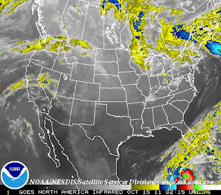
This map was taken from a NOAA satellite and it shows a recent image of the United States. The image is taken in the infrared band light span to show heat within objects. Color demonstrate the variety between the cooler and warmer objects, colder are brighter while warmer are darker. Altitude also has an affect in this image because clouds closer to the continental surface tend to have warmer temperatures, these are depicted by the color gray. Colder clouds, which are generally formed at higher altitudes are highlighted in color because the purpose and focus behind this federal institution is to alert people of possible weather hazards. These clouds are more likely to become a supercell, which provides stronger storms with higher intensity winds, rain, thunder, and possibly produce tornadoes. The infrared system is useful for both day and night since it detects the image based on temperature differences. 
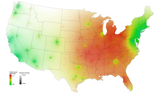
The above image shows water vapor in the atmosphere. I have decided to include both these pictures to contrast the difference in the changes of temperatures as compared to atmospheric moisture, during the same period of time. Instead of an infrared satellite picture, this image was taken using a wavelength sensitive to the density of water vapor in the atmosphere. Once again, color and brightness is used to indicate high water vapor, while colored and white areas include high moisture and, or ice crystals-which once again, are more intense, and hazardous weather conditions. Black and brown areas have little to no moisture. This can be areas where there is a drought. It is importance to notice that conditions for La NiƱa have been detected, which might be affecting the weather system, and this map. These conditions may intensify with time. Wavelength imagery is useful for moisture and atmospheric circulation indicators, as opposed to infrared which is better for determining temperature.